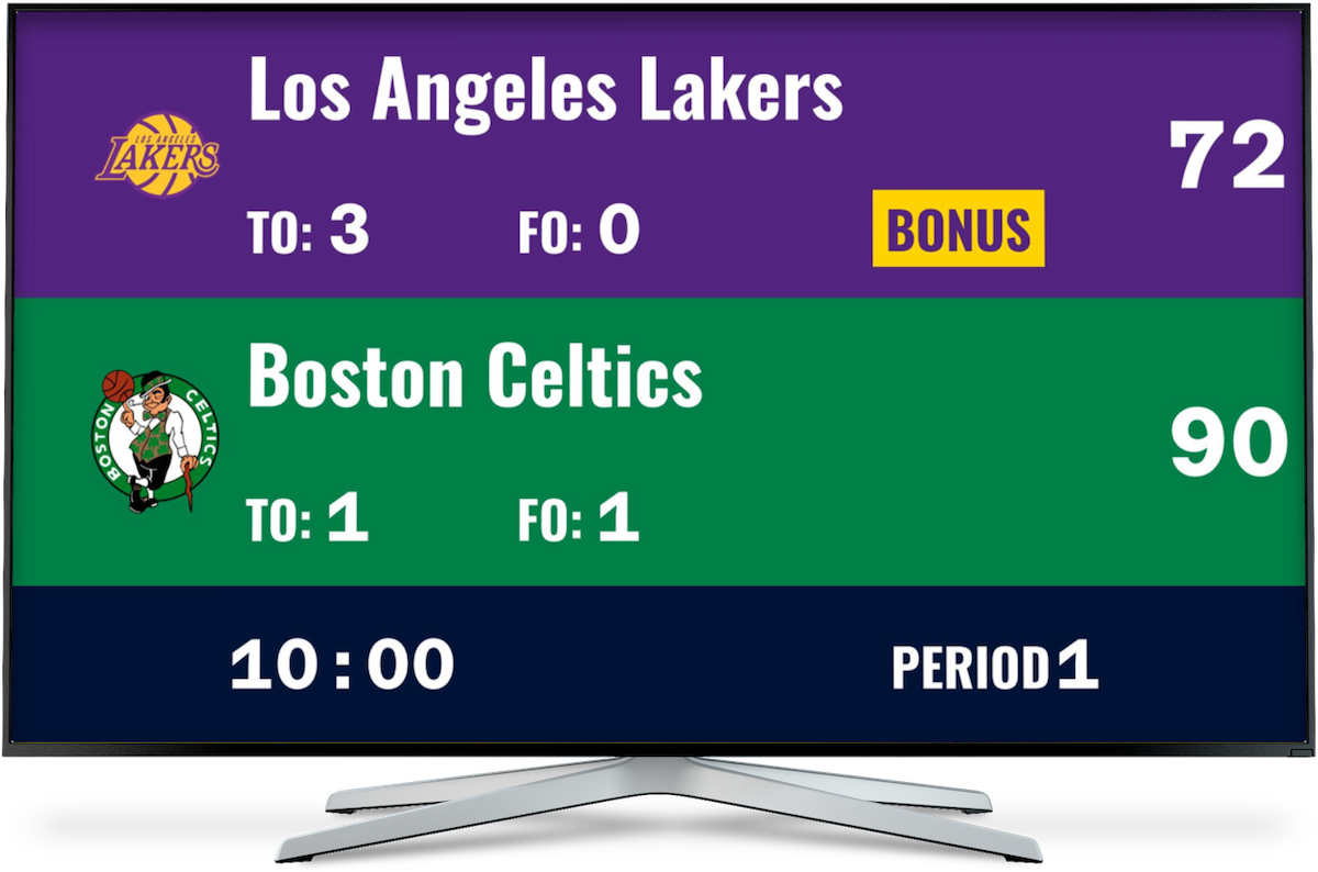
What are bar chart races?
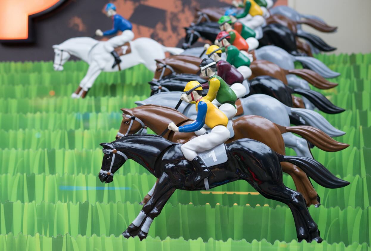
Go to any carnival and you’re likely to come across a beloved game: the horse race. A row of stools positioned side by side behind individual skee-ball tables await those ready to try their luck. As the players roll their balls into the holes, their horses race forward. The biggest thrill is of course watching along as your opponents score points and edge forward. This kind of dynamic interaction between input and output is also what makes bar chart races so engaging for viewers. But what exactly is a bar chart race?
 When races where simpler
In the simplest terms, bar chart races are like gamified data. They take static data and present it in a dynamic way, creating a visually appealing analysis of data trends. Like your standard bar chart, a bar chart race focuses on one specific data point or attribute for a specified category segment. For example, the population growth (attribute) in coastal cities (category). However, unlike a bar chart, it presents the shift in this data point over a specific period of time: days, months, years, centuries. This fluctuating and evolving approach to displaying data adds significantly more entertainment value to otherwise dry statistics, which makes bar chart races an effective tool for holding an audiences’ attention.
Popular Use Cases for Bar Chart Races
As mentioned, population growth is a popular metric for bar chart races. By inputting demographic data into a bar chart race, you can animate the increase and decline in population size of global metropolises and bring relocation trends to life. But there are plenty of other uses for bar chart races. For example:
-
Tracking sports statistics: Sometimes it feels like every Olympic sporting event involves a record-breaking time. As a species, we are running and swimming faster, jumping higher, and taking skills and athletic feats to the next level. A bar chart race is an ideal tool for depicting how we have improved over e.g. the past century. In case you’re curious, the fastest swimmers are currently about 3 seconds faster in the 50m race than they were 50 years ago.
-
Livening up quizzes and online events: Make your weekly pub quiz event more interesting by creating a bar chart race of past victors. Which teams had the most wins over the course of the year? Which categories did players score best and worst in?
-
Keeping score for your algicosathlons: After each round of your algicosathlon, update each participant's score to show real-time shifts in the rankings. At the end of the algicosathlon, use the bar chart race to display the fluctuating positions throughout the entire event.
 This is what an algicosathlon could look like in real life.
These are just a few examples. However, bar chart races are handy any time you want to observe a change in statistics over a given amount of time. Use them to motivate your sales team by showing how successful different campaigns have been over the years; to monitor improvements in fitness levels in your workout group based on strength and endurance data; to track your personal productivity over the course of a year.
KeepTheScore.com: The Ultimate Solution for Creating Bar Chart Races
Most bar chart races require you to upload a spreadsheet or other file format with your data. This is fine if you already have your data neatly organized. But what if it is being calculated and updated on-the-go? That’s where KeepTheScore comes in! What are the key benefits of our bar chart race product?
-
Simplified data input: KeepTheScore lets you add data to your bar chart race without having to upload external files. Simply click on the point boxes to add or subtract points to each team or participant.
-
Real-time flexibility: With KeepTheScore, you don’t have to wait until a game is over to adjust your scores. Update your bar chart race during play to provide up-to-the-minute results.
-
Greater adaptability: If your category segment changes, e.g., the number of participants, you can easily make the necessary changes to your bar chart race.
-
Ease-of-use for the tech challenged: Our manual updates make KeepTheScore easier to use for bar chart races since users can forgo potentially complicated steps like e.g., the conversion of incompatible file formats.
KeepTheScore’s solution is a live bar chart race and does not include a playback or video function. This makes it a great tool for spontaneous events or games and activities happening in real-time.
Conclusion
Looking at data doesn’t have to be a snooze fest. On the contrary, with bar chart races it can become an interactive experience, one that tells a story to viewers. So check out KeepTheScore’s latest product and let us know how you manage to bring your data to life!
FAQs About Bar Chart Races
How do bar chart races work?
Bar chart races provide an animated and dynamic glimpse of changing statistics over a predetermined time span. The bars represent specific categories (i.e., countries, teams) and their lengths change based on the input data. The longer the bar, the higher the ranking
How do bar chart races differ from traditional bar charts?
A traditional bar chart is static. It offers a snapshot of data at a single point in time. By contrast, a bar chart race shows how data has changed over a period of time so viewers can detect trends and shifts.
What are bar chart races used for?
Bar chart races are ideal for presenting fluctuating data. They are commonly used to monitor population growth, economic statistics, social media followers, election results, or any data with fluctuating growth rates.
What are the key benefits of using a bar chart race?
Bar chart races illustrate data in simple visuals, making them easy to understand. They also tell a story through data by highlighting how different people, places, and happenings compare to one another. This makes them far more engaging than static bar charts and more helpful for anyone who wants to keep an audience engaged and interested.
What are the common mistakes to avoid when creating a bar chart race?
When creating bar chart races, don’t overload the visual with too many categories. Maintaining a manageable number of bars makes it easier to follow the “race”. Make sure that you also provide sufficient context for your data so viewers can quickly understand the who, what, and when of your data.