What are lower thirds in video broadcasting?
Lower thirds graphics have become an indispensable element in broadcasting. If you're new to broadcasting read on!
Article Contents
What are lower thirds?
Lower thirds are the text graphics that pop up in the bottom of the frame during a video — a speaker's name, a place, a news ticker. They carry extra information without blocking the main shot. The name comes from where they sit, not their exact size. A lower third doesn't actually need to cover the whole bottom third of the screen; it just lives somewhere in that zone.
Common uses:
- Speaker names and titles
- Location information
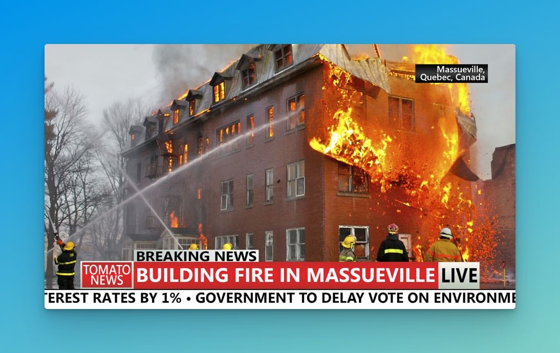
- News tickers and headlines
- Time and date stamps
- Weather data and stock quotes
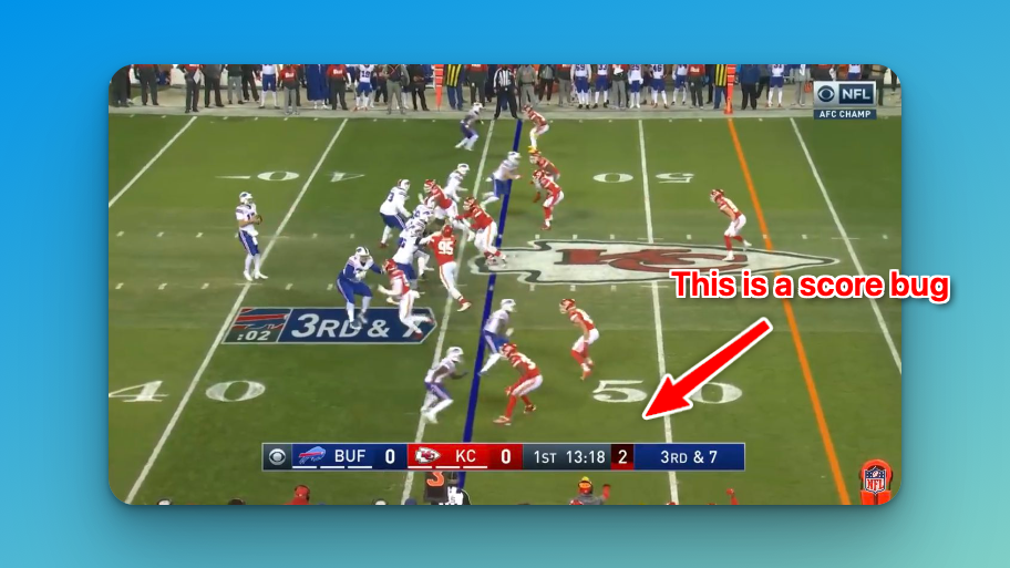
- Sports scores (similar to score bugs in sports broadcasting)
What the industry calls them
Different broadcasters have different names for the same thing. Where someone trained will usually tell you which word they reach for:
- CG — short for "character generator," the hardware that originally made these graphics
- Chyrons — a US term, from the Chyron Corporation's Chiron I character generator in the 1970s
- Superbars or Supers — another common US one
- Name straps or Astons — UK terminology, after Aston Broadcast Systems
- Captions — a more general catch-all for on-screen text
Clean feed vs. program as broadcast
Two terms worth knowing if you're working with broadcasters:
- Program as broadcast (or "dirty") — the video with lower thirds and graphics baked in
- Clean feed (or "textless") — the same video without any graphics
International distributors need clean feeds so they can add their own localized text. Producers cut textless versions during the master recording specifically for this — it's not an afterthought.
Designing lower thirds that work
A lower third has about two seconds to do its job. The viewer glances down, picks up the info, looks back at the main shot. Everything about the design has to serve that.
Keep it simple — one clear message per graphic, strong contrast between text and background, a font that's actually legible. Decorative fonts look interesting in a mockup and unreadable on a screen at speed.
Color matters, and not just for the aesthetics. Test your lower third against several different backgrounds: a talking head, an outdoor scene, a dark studio. If it disappears into the footage, it isn't doing its job.
For duration, 5–7 seconds works for most standard lower thirds. Longer text needs more time on screen; short name tags can come and go faster.
Software for creating lower thirds
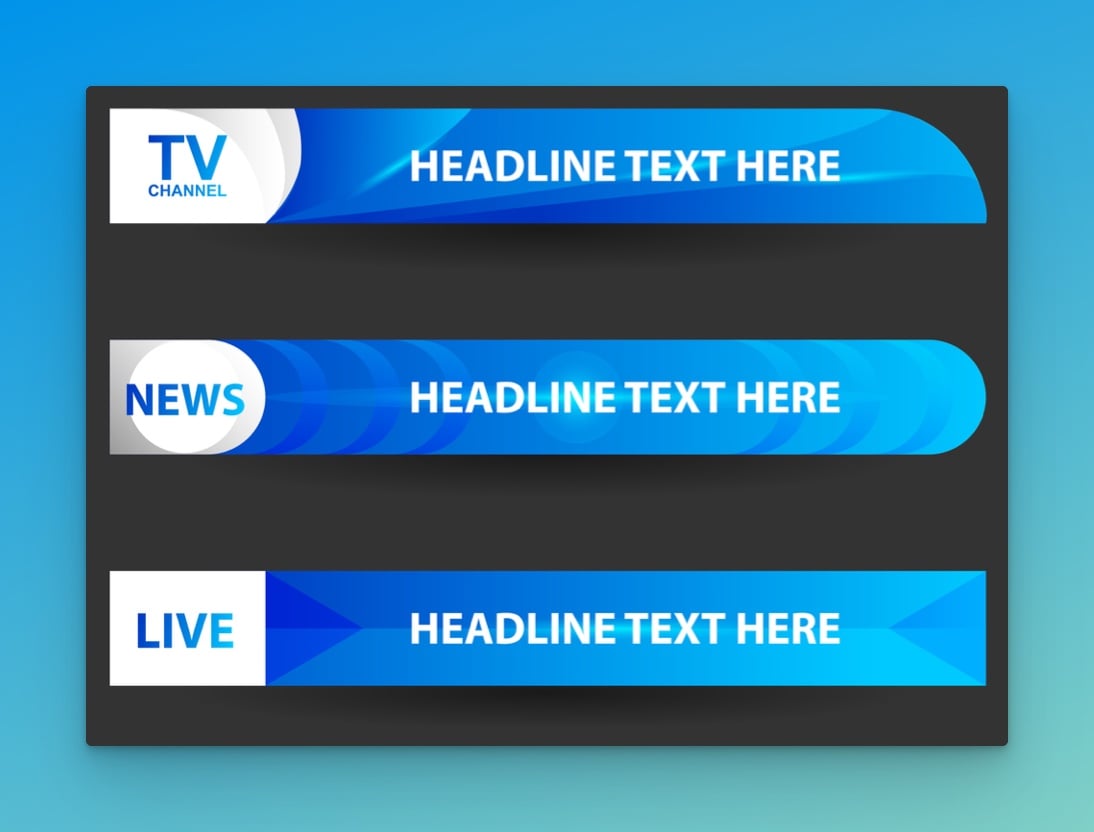
If you're starting out, templates are the fastest path to a result that looks professional. The usual sources:
- Adobe Premiere Pro — built-in lower third templates, fully customizable
- Final Cut Pro — Apple's equivalent, same idea
- Canva — web-based, easy to use, free tier available
- Stock template sites — pre-built designs you can modify to match your branding
Once templates feel natural, dig into the animation tools in whichever editor you're using. The standard news look is a simple fade in/fade out. Corporate work tends toward subtle slides or scaling. Creative content can push further — but match the animation to the tone. A hyperactive motion graphic in a corporate interview looks unprofessional; a flat fade in an esports broadcast looks dead.

Written by Caspar von Wrede
Founder of KeepTheScore. Building tools that help teams track scores and celebrate wins.